

The works in this exhibit are all later versions or publications of titles, authors, or documents that are represented in the Rouse Medieval Manuscript collection. The exhibit content was created by students in a History of the Book seminar in Winter 2014 in the Information Studies Department at UCLA.
Exhibit Home
1. An exact collection of all remonstrances,...
3. Divi Avrelii Avgvstini Hippon. Episcopi...
4. Horae in laudem beatiss[ima] Virginis secu[n]dum....
5. Hore in laudem beatissime Virg[inis] Marie...
6. Les memoires, contenans le discours de plusieurs...
7. Modus Bene Viuendi (Modus Bene Vivendi)
8. Psalteriu[m] v[ir]ginis sanctissime [secundum]...
9. Q. Asco. Pediani In Ciceronis orationes...
10. Quaestiones super XII libros Metaphysicae...
11. Stimulus diuini amoris Sancti Bonauenturae
12. Varii sermoni de Santo Agostino...
13. Varii sermoni di Santo Agostino
Title Horae in laudem beatiss[ima] Virginis secu[n]dum consuetudinem Romanae curiae ; Septem Psalmi poenitentiales cum litanijs & orationibus ; Sacrificium in laude[m] Sanctiss[ima] Virginis ; Vesperae mortuorum.
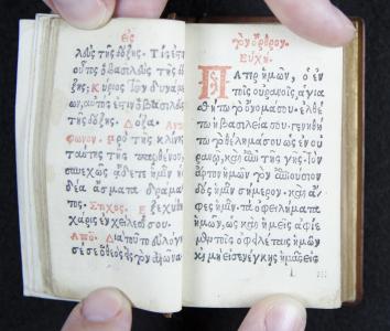
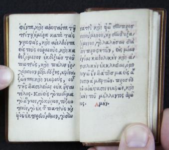
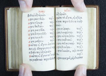
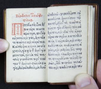
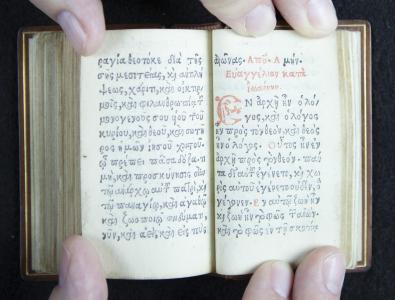
Brief description This book, printed mere decades after the invention of Gutenberg’s printing press, captures a snapshot of a moment of change in the history of the book. In particular, the selection of Greek font types used in this book showcases prime examples of the inconsistent and individualistic nature of early printing. It is important to remember that when this book was printed in 1520, books had just begun to transition away from the age-old traditions of manuscript writing toward the more consistent and established printed form that we use today. In some illuminated manuscripts, the initial capital letter at the beginning of a section of text was decorated with an individual illustration. In this particular book, a very early instance of printing in Greek, you will find elaborate forms of many of the initial capital letters printed in red ink as section headers. If you look closely, you will notice that, even for the same capital letters, the decorations are varied. Instead of simply creating one mold from which to create identical instances of type, multiple variations of type molds were created for many of the capital letters. For example, there are three different variants of the capital character “omega”: Ω. And there are three different variants of the capital character “omicron”: Ο. Although there is not a unique illustration for each initial capital letter, the printer took care to create more than one version of each of the capital letters. There are repeated characters, but there is nonetheless some variety. This highlights the transitional state of early printed books between individually handcrafted items and mechanically reproduced items. In this book there are many printed examples of Greek ligatures, which are stylized abbreviations that are commonly found in handwritten manuscripts. As with the initial capital letters, while ligatures are often repeated throughout the text, there is still more variety than is found in modern texts. In fact, there is at least one particular place in the book where you can see that there are two different variants of ligatures to spell the word “kai” (meaning “and”)—both printed on the very same page! Whereas in handwriting the word would need to be written twice, regardless of its shape, for printing a different type mold had to be created for each ligature. In the case of “kai” then, it was double the labor for the printer to create two separate molds to represent the same word. It remained important to retain some artistry in the printed text. Most notably, the particular font that the Giunta printing press in Florence uses is uncannily similar to the font developed by their foremost competitor, Aldus Manutius, who worked in Venice. In fact, “the Guinta family of publishers possess the reputation, among historians of the early Italian printed book, of being intellectually inferior imitators of the rival firm of Aldus Manutius… Even worse, the Giunti also stand accused of shamelessly copying the pioneering editions of Greek and Latin texts which Aldus toiled heroically to produce… ” Consider for a moment the fact that only a few decades previous to the printing of this book one of the criteria for producing a “good” manuscript was accuracy, and accuracy was achieved by very strict attention to detail while copying an existing manuscript. Thus it might be possible to interpret the similarity of Giunta fonts and ligature styles to the Manutius style in a purely innocent manner, as measure of the quality of the Giunta printing, and the fine regard with which the Guinti respected the Manutius press. However, it turns out that explication is altogether too naive, even taking into consideration the historical context, for: “Indeed, in 1506, the two firms were involved in a lawsuit, about which only a few tantalizing fragments of evidence survive, over Filippo di Giunta’s violation of the comprehensive papal privilege issued by Leo X to cover Aldus’ Greek and italic types.” Yes, to add insult to injury for the Giunti, Pope Leo X had granted special “intellectual property” privileges to Manutius to the detriment of the Giunti, even though Manutius was a Venetian, while the Giunti and the pope himself were both natives of Florence. (Venice and Florence were rival city-states in this era.) Curiously, by the time this book was printed in 1520, Pope Leo X had a change of heart, as the colophon of the book notes the year and date of the printing, and specifies “Leone. X. Pont.” (“while Leo X was Pope”). These examples, so beautifully preserved in this book, serve to highlight for us some of the transitions that took place at the very inception of the print industry. And as part of intellectual/cultural history This book raises the questions we ask about any historical item into high relief: For whom was it created and why? It demonstrates how an item is not merely an item in isolation; everything is created in context, and without adequate knowledge of its context, we cannot understand the object. And it shows how many different events in history, which may initially seem unrelated, overlap with each other. In particular it highlights the status of immigrant communities during the Italian Renaissance, and calls attention to the lives of the Greek scholars who migrated from the Byzantine empire in order to escape Turkish/Arab persecution and the downfall of the Byzantine society. These Greek scholars enabled the rediscovery of classical Greek texts and were influential in the establishment of the Humanist movement during the Italian Renaissance. In addition, religion and culture remained highly intertwined in that era. So this book raises the question of who was the intended audience. Was it meant for a nouveau Italian humanist who wanted the latest collectible, perhaps to use as study material, or perhaps simply as an accessory? Or was it to be provided for Byzantine immigrants to aid them with their worship in the Uniate church, following the Roman Rite under the Pope, but yet retaining their traditional style of worship in Greek? Through this question, yet to be answered, we see the intersection of the rise of the Humanist movement in Italy with the Turkish invasion of Byzantium and the exodus of significant numbers of educated Greek-speakers. Notes: Katherine M. MacDonald, “Selling Lives: The Publisher Bernardo Di Giunta (fl. 1518-50), Imitation and the Utility of Intellectual Biography,” Renaissance and Reformation / Renaissance et Reforme 25, no. 3 (2001): 1, http://jps.library.utoronto.ca/index.php/renref/article/viewFile/8709/5676.
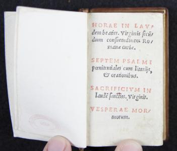
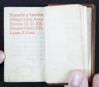
Physical description The book is printed using two colors of ink. Black ink is used for the main text, for the woodblock print illustration, and for the printer’s mark or logo. Red ink is used for initial letters, for the section titles at the top of each page, and for other words or phrases that the printer wanted to highlight. Very consistently, throughout the entire book, all sentence-initial words begin with a letter in red ink, except in one section of the book. The section without the red-ink initials is the “Our Father” prayer. According to the Christie’s catalog description, the red lettering was printed before the black-inked letters. There is one page, which looks like a printer’s error, on which the red print is not horizontally lined up with the black print; all the red characters and words line up a half a line-height below the black characters. There are two printed images in the book, both in black ink. Opposite the Greek title page, and on the reverse of the Latin title page, is a full-page woodblock print illustration. It is described thus by Bennett Gilbert: “This small devotional woodcut is Venetian, rather than Florentine, in style and perhaps came to Filippo through his brother Luc Antonio. It is a perfect picture, in the small Malermi format, one of the kind of scene that probably appeared widely in the larger format of early single-leaf woodcuts, with the image of God in the heavens sending the Holy Spirit on the wings of a dove to Mary, seated in a room opening to an exterior.” I particularly appreciate the way the illustration depicts God interrupting Mary while she is seated reading an anachronistic codex-style book. The second image is a full-page printer’s mark. It depicts the Giunta family fleur-de-lis held aloft by two nude cherubs standing on a shelf decorated with an angel head and wings. Two pages in the book are printed in Latin. There is a title page, in both red and black ink, with the black letters in italic font, and there is the final page containing the publication information. The title page reads thus: HORAE IN LAV/ dem beatiss. Virginis secu/ dum consuetudinum Ro/ manae curiae. SEPTEM PSALMI paenitentiales cum litanys, Et [et] orationibus. SACRIFICIVM IN laude sanctiss. Virginis. VESPERAE MOR/ tuorum. The page containing publication information is printed entirely in red ink, and reads: Florentiae p haeredes Philippi Iunte. Anno Domini M.D.XX. Die uero Martii.VII. Leone. X. Pont. There are a few interesting items to note on the two pages printed in Latin. Abbreviations and ligatures derived from manuscript writing are included in this printing. For example, “beatiss.” is an abbreviation for “beatissimae”, and “Sanctiss” is an abbreviation for “sanctissimae”. Several examples of ligatures are the “u” which stands for “un” in “secundum”, the “ÿ” which stands for “ii” in “litaniis”, and the “p” which stands for “per” in “Florentiae per haeredes”. In the non&endash;capitalized letters, characters “a” and “e” are conjoined in the ligature character “ae”, and “o” and “e” combine to be printed as “oe:. Yet the same does not hold for capital letters. Capital characters “A” and “E” are printed next to each other in “HORAE”, but are not conjoined in the “AE” character. Furthermore, in the non-capitalized letters, there is an instance where “e” stands in for “a” followed by “e”, in “Giunte,” instead of using the “ae” character. So there is a great deal of inconsistency in the Latin printing, even in just two pages. The remainder of the text pages is in Greek. There is an even greater variety of ligatures and abbreviations used in the Greek text, and a corresponding number of idiosyncrasies and inconsistencies. As one example, on the same page there are two different variants of ligatures to spell the word “kai” (meaning “and”). However it is nice to see clear spaces between words and punctuation. Periods and commas are used similarly to how we use them even today in English. And there is hyphenation for words that are broken in the middle to wrap to the next line: a “/” is used instead of a hyphen. There are examples of this on the Latin title page, and throughout the text in Greek. According to the Christie’s catalogue description: “160 leaves; a–u8 (u7 blank), printed in red and black in two operations (red first), greek type, roman type for title and colophon, 13 lines, woodcut of the Annunciation, publishers’ woodcut device (extreme outer blank covers of the first few leaves and the last leaf restored), modern calf gilt, g.e. [Pettas p. 213; Bohatta 1491], 32mo (75 x 45mm.), Florence, for the heirs of Filippo Giunta, 7th March 1520 [i.e. 1521]” Christie’s Auction House, “Auction Results, Sale 4558, Lot 73,” accessed February 23, 2014, http://www.christies.com/lotfinder/lot/no-description-2891408-details.aspx?intobjectid=2891408. According to the UCLA catalog description: “Title-page in red and black; text in black, with capitals, running titles, and instructions in red. Woodcuts: full-page woodcut of the Annunciation on verso of t.p.; full-page printer’s device on last p. (the Giunta fleur-de-lis supported by two putti holding floral branches); ornamental initials. Signatures: a–v⁸ Spec. Coll. copy: brown calf boards; gilt filet; gold-stamped spine title ‘Horae in laudem B. Virginis. 1526’; all edges gilt. In marbled paper slipcase; in modern brown leather and beige cloth-covered clamshell box with title ‘Catholic Church. Horae in laudem Beatiss. 1520’”
Content description This is a Book of Hours, which contains devotional texts and prayers. Books of Hours were designed for laypeople to use for private devotions throughout the day in a way similar to, but less rigorously, than monks and nuns of the time. However, Books of Hours were not always used solely for reading. On some occasions a Books of Hours could become merely a common devotional “accessory,” used to flaunt the owner’s piety and good taste in acquiring such a lovely item. Or a Book of Hours might be carried around on one’s person as a type of good luck charm or for protection. Books of Hours first began to appear throughout Europe in the 13th century. Initially Books of Hours were individual works of art, and beyond the means of all but the very wealthy. By the 15th century, as division of labor and techniques of mass production became employed in the production of Books of Hours, while they were still expensive, they became a luxury item that many middle class people could afford. This trend continued with the introduction of printed Books of Hours. A Book of Hours is like an abbreviated form of a breviary. It contains a simplified version of the prayers traditionally incanted in veneration of the Virgin Mary during eight periods throughout the day by monks and nuns. There is no official format for a Book of Hours, and each version may contain different selections of prayers and devotional literature. A Book of Hours naturally includes a section for the Hours of the Virgin. There appear to be slightly different versions of prayers for the Hours, as each version specifies “according to the Roman Curia” or various other styles, such as “a l’usage du Mans” or “Use of Utrecht.” Within the Hours of the Virgin, there are different sets of prayers to be used during Ordinary Time, during Advent, and during the Christmas season. Other sets of prayers might be included for the Hours of the Cross or the Hours of the Holy Spirit. Customarily a Book of Hours might include a church calendar and some selections from the Gospels, although this version does not.[1] This version contains the Seven Penitential Psalms, along with Litanies, wherein saints in a specified order are invoked individually by name: “Saint Peter, pray for us. Saint Paul, pray for us. Saint Andrew, pray for us… ” And finally, this version, like many others, contains prayers in the Office for the Dead. The majority of Books of Hours were written in Latin. Although many middle class people were not educated in Latin, the prayers of the Church were conducted in Latin, so they would likely have been familiar with the contents of the book. Latin and vernacular Books of Hours were very common, but what would be the motivation for creating a Book of Hours in Greek? There are a couple of theories, but neither are entirely convincing, nor entirely far-fetched. In fact, either is plausible. At around this time, Byzantium, a Greek-speaking region, was being overrun by Turks, so a significant number of people from the region were emigrating. Many ended up in Italy, Venice in particular, since Venice and Byzantium had long been trading partners. So it is possible that this Greek Book of Hours was published for these recent immigrants. But the problem with this theory is that this Book of Hours, while it is in Greek, is written according to the Roman Rite instead of the according to Eastern Orthodox usage. It turns out that there was, at the time, a community of immigrants who worshipped in the Uniate Church. This church operated under the auspices of Rome and the Pope, but was granted special dispensation to retain its traditional style of worship, including worship in Greek. However, this is a highly specific audience for which to print a book. Additionally, the pages of this copy of the book are so clean and crisp that they do not appear to have been used. So I remain slightly skeptical about this theory. Also around this time, the Humanist movement was beginning, and there was an increased focus on a “return to the classics.” The works of the famous ancient Greek authors were being rediscovered and translated into Latin or vernacular languages, and educated gentlemen were increasingly taking up the study of the Greek language. It is possible that this Greek Book of Hours was created as a type of novelty, or even as a study aide. The educated gentleman would already know the Book of Hours in Latin, so it would presumably be of interest to try to compare the Greek with the Latin. The problem with this theory is that the Book is exclusively in Greek, while other books published around the same time contained parallel Greek and Latin texts. Furthermore, Church Greek is a type of koine Greek, a common or vernacular version of Greek used post-classically, while the Greek in which the famous ancient Greeks wrote was Ancient Greek. So, this theory too is not entirely convincing. Clearly these questions still need more investigation. [1] Ransom Center at the University of Texas at Austin, “Books of Hours at the Ransom Center,” Harry Ransom Center at the Univeristy of Texas at Austin, accessed January 27, 2014, http://www.hrc.utexas.edu/enews/2010/may/booksofhours.html.
Contributor: Cecilia Platz
Contribution date: Winter 2014
Full title: Horae in laudem beatiss[ima] Virginis secu[n]dum consuetudinem Romanae curiae ; Septem Psalmi poenitentiales cum litanijs & orationibus ; Sacrificium in laude[m] Sanctiss[ima] Virginis ; Vesperae mortuorum.
Date 1520
Location Florentiae [Florence]
Dimensions H 9 cm, W 5cm, D 2 cm.
Technologies of production Letterpress Printing
Additional information There are hundreds of versions of Books of Hours which were created, both as manuscripts and as early prints. The majority are written in Latin, and many more are in French, German, English and other vernacular languages. But other editions that would be of most interest would be other early printings of Books of Hours in Greek. There were several early attempts at Greek printing in Germany, but due to the influx of immigrants from Constantinople into Italy, primarily Venice, at that time period, the center of Greek language publishing soon shifted to Italy. The Greek printing style of Manutius had a strong influence on the industry, and many, including the Giunta press, imitated it. The first printed edition of a Greek Book of Hours seems to have been produced by Aldus Manutius: Horae beatiss. Uirginis secundum consuetudinem romanae curiae. Septem psalmi paenitentiales cum Letaniis et orationibus, &c. It was published in size 16mo in December of 1497, with black and red letters, and contains a woodcut print picturing the Annunciation. The location of printing is unspecified, so we can assume it to be in Venice, which is the location of the Manutius printing and publishing headquarters. This version was followed by another Aldus Manutius printing of the same title, with the text again in Greek in black and red, in July of 1505, and again we assume the location to be in Venice . This 1505 version was printed in size 32mo, which is the same size as our petite Giunta 1520 version from Florence. And interestingly, Aldus Manutius published another version in size 32mo in June 1521, the year following our Giunta 1520 version. The UCLA Research Library Special Collections has a copy of the Manutius 1497 version, and a copy of the 1505 version, but not the Manutius 1521 version.
ConditionBased on the physical aspects of the book described, I would speculate that this book has been treasured for quite a long time. Tbe very tight binding and the brightness of the gilding on the page edges, suggest that the book has been re-bound and the edges re-gilded. The slipcover was probably made at the same time as the rebinding, since with the rounded and matching leather-tipped ends it appears custom made to match the book. Quite a bit of care was invested in the rebinding, as evidenced from the exquisite detail of the fine-lined gilt edging along the edges of the covers and the spine ends. However, it seems likely that the book was re-bound quite a while ago, since enough time has passed that the back hinge is significantly weakened, and the front cover is entirely detached. Since the first few pages of the front and the back of the book seem to have slightly more smudging than the deep interior text pages, it seems like the book, at least in its later life, was a collectible that was frequently shown off as a curiosity, but seldom, if ever, read or used in its entirety. When inspecting the book, people opened the front cover to see the woodblock print, the title page in Latin, and perhaps the first several pages of text in Greek. Often they would turn the book over, open the back cover, and look at the final page which has the printer’s mark, and the previous page with the publication information in Latin. The rest of the book, being in Greek and presumably unreadable, did not merit the same attention. That would explain why the hinges are in poor condition while the rest of the binding is tight and the gilding on the edges is in such fine condition. The physical aspects of the book raise several questions. The part where the back bottom outer corner of the cover is worn down is puzzling. Would that not have been fixed when the book was re-bound? And in the time since the book was re-bound, great care has been taken with the book, as can be seen from the condition of the rest of the book edges, and the slipcover. So why is there a flaw there? Have the interior text pages of the book have ever been cleaned. There are some pages where the print does not seem as clear, as crisp or as bright as other pages. Is that a relic of the original printing conditions, or is that a result of later attention?